Let's Build a Health-Awareness Machine Learning Web App to Predict Life Expectancy - On Teachable
Introduction
Are you ready to change the world? How about we start with a great model on predicting life expectancy for anybody around the world and then port it to the web?
Code
from IPython.display import Image
%matplotlib inline
import matplotlib
import matplotlib.pyplot as plt
import io, base64, os, json, re
import pandas as pd
import numpy as np
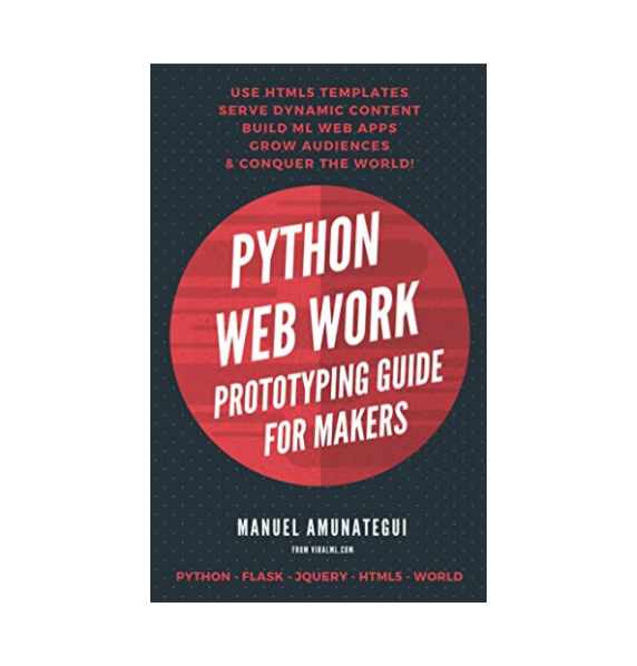
Image(filename='viralml-book.png')
How Much Time Do You Have Left To Live?
Take the free class on Teachable - click here
Changing the world one webapp at a time! Let me show you how to build a health awarness data sciece application.
Don't forget to sign up for my newsletter and get updates on my live and free webinars:
Check out a version of the finished product here:
Image(filename='time.jpg')
Can you change the world with a web app? Heck Yeah! I'm not talking about a vague action with a passive reactions, like butterflies flapping their wings and creating hurricanes 20,000 kilometers away. I am talking about making a much more concerted effort towards social good - to affect change, to help communities that could really benefit from smart people like you, with data collection, data science, machien learning, and a data driven web applications.
So my question is really, can you ideas chnage the world?
In this class I'll show you how easy it is to take those Python ideas and extend them into a useful, professional, actionable web applications using Flask, HTML responsive templates and some sensible UI design - as that's really the heart of all this - we want to translate or even shed our programming, statistics, Jupyter notebook navigation into the universal language that is the web that everybody knows how to use, how to interact with.
We'll build a health-awarness web application to predict life expectancy. Let's take a look at a finished product -
https://www.timelefttolive.com
This is an interactive tool to show you what is your average life expecatnacy at your current age and using additional parameters. It uses statistics, real localized data, and has a minimal UI, and is fully responsive - are you ready to build things that matter?
We're going to build a slight simpler version, but this will give you an idea of what we're going to build. I also hoping that this class will show how easy it is to build such educational or socail service pipelines to encourage you to apply their own domain expertise to address the prolblems they see around you.
So welcome to this class, my name is manuel amunategui, you may know me from the ViralML show on YouTube. so, let's get to it. So please sign up for my newsletter on my site.
This is really exciting. We're going to be using the most popular model out there in the entire world. The linear regression. Why is it popular. Because it's simple and extremely intuitive.
Modeling life expectancy is clearly in the realms of statistics but when you extend it to the Internet in an interactive and educational form, it becomes applied data science. In this walk-through, we’ll tie a simple linear regression model to a Flask web application, in essence, transforming an equation into an interactive tool from which the entire world can play with and learn from.
Let’s talk life expectancy. Though I see this topic as an important awareness tool, I apologize in advance to those that find it depressing. It’s up there with those interactive banking tools that remind you how much money you don’t have to properly retire.
We’ll mount the model using PythonAnywhere.com, an easy to use web serving platform that is free for experimenting. We’ll also use fun graphics and simple language to make sure it’s to-the-point and inviting. You can check out a finished version at TimeLeftToLive.com.
This is a surprisingly easy model to build using solid data curated by top statisticians. Two top sources are the World Health Organization (WHO) and the Central Intelligence Agency (CIA). Here we’ll use the World Health Organization (WHO) Global Health Observatory Data.
Mortality Data We’ll use the combined data sets of ‘Life expectancy at birth (years)’ and ‘Life expectancy at age 60 (years)’. This is going to give us two points for our linear regression from which we can easily extract any other age. Again, take this with a big grain of salt! These are only averages and life expectancy keeps improving everyday! From the WHO site:
Life expectancy at birth (years)
The average number of years that a newborn could expect to live, if he or she were to pass through life exposed to the sex- and age-specific death rates prevailing at the time of his or her birth, for a specific year, in a given country, territory, or geographic area.
Life expectancy at age 60 (years)
The average number of years that a person of 60 years old could expect to live, if he or she were to pass through life exposed to the sex- and age-specific death rates prevailing at the time of his or her 60 years, for a specific year, in a given country, territory, or geographic area.
Simple Linear Regression and Predicting Life Expectancy
A linear regression model attempts to explain the relationship between two or more variables using a straight line. ReliaSoft’s Experiment Design and Analysis Reference We’re going to use the scipy.stats package for our linear regression. Let’s look at a simple example to illustrate how we can predict using a linear regression. We create a fictitious data set of two life expectancies, one for a newborn and another for a sixty-year-old:
import pandas as pd
import matplotlib.pyplot as plt
# create fictitious data set
simple_life_dataset = pd.DataFrame({'Age':[0, 60], 'Life Expectancy':[90, 30]})
simple_life_dataset.head()
Now we feed that data into the stats.linregress function. We’ll only use two of its outputs, the slope and intercept. Those two values and the y = mx+b line equation, will give us everything we need to estimate life-expectancy for any age.
import numpy as np
from scipy import stats
slope, intercept, r_value, p_value, std_err = stats.linregress(simple_life_dataset['Age'],simple_life_dataset['Life Expectancy'])
print('intercept: ', intercept)
print('slope: ', slope)
np.ceil(slope * 20 + intercept)
We get 70 years of life left. And if we plot our fictitious data set along with our new estimate:
fig, axes = plt.subplots(figsize=(5,5))
x = [0,20,60]
y = [90, 70, 30]
axes.plot(x,y, color='blue', linestyle='--', marker='o')
fig.suptitle('Life Expectancy')
axes.set_xlabel('age')
axes.set_xlim([-5,100])
axes.set_ylabel('life_expectancy')
axes.set_ylim([0,100])
plt.grid()
plt.show()
The linear relationship between age and life expectancy according to our fictitious data
WHO Mortality Data
Let’s download real data and save it locally. Then let’s run through the exact same exercise as above:
# load WHO longevity data
# http://apps.who.int/gho/data/node.main.688
who_list = pd.read_csv('http://apps.who.int/gho/athena/data/GHO/WHOSIS_000001,WHOSIS_000015?filter=COUNTRY:*&x-sideaxis=COUNTRY;YEAR&x-topaxis=GHO;SEX&profile=verbose&format=csv')
# save a local copy of the data set for our Flask prototype later on
who_list.to_csv('WHOSIS_000001,WHOSIS_000015.csv')

# Keep only useful features fix case display of country text
who_list = who_list[['GHO (DISPLAY)', 'YEAR (CODE)' , 'COUNTRY (DISPLAY)', 'SEX (DISPLAY)', 'Numeric']]
who_list['COUNTRY (DISPLAY)'] = [ctry.title() for ctry in who_list['COUNTRY (DISPLAY)'].values]
# print a few rows
who_list[who_list['COUNTRY (DISPLAY)']=='France'].head(10)
I am a 50-year old American, let’s predict how many years of life I have left (yikes!). First let’s look at the data, this is really interesting. The life expectancy of a new born male in the USA using the latest data, is 77 years, while a 60-year-old male in the USA using the latest data is 22 years which totals 82 years, what gives? That’s one of the complexities of statistics, taking averages for a sixty-year-old implies that this person already survived 60 years, this is called Survivorship bias. And what it means for us here, is that the model will be slightly pessimistic for those closer to zero and slightly optimistic for those closer to 60.
country = 'United States Of America'
sex = 'Male'
# pull latest entries for birth and 60 years for a country and gender
sub_set = who_list[who_list['COUNTRY (DISPLAY)'].str.startswith(country, na=False)]
sub_set = sub_set[sub_set['SEX (DISPLAY)'] == sex]
# sort by year in descending order to work with the latest read
sub_set = sub_set.sort_values('YEAR (CODE)', ascending=False)
sub_set_birth = sub_set[sub_set['GHO (DISPLAY)'] == 'Life expectancy at birth (years)']
sub_set_60 = sub_set[sub_set['GHO (DISPLAY)'] == 'Life expectancy at age 60 (years)']
print('sub_set_birth:')
print(sub_set_birth.head(5))
print('sub_set_60:')
print(sub_set_60.head(5))
Let’s pull the two latest data points from the WHO data set and plot it out:
# create data set with both points as shown in first example
lf_at_birth = sub_set_birth['Numeric'].values[0]
lf_at_60 = sub_set_60['Numeric'].values[0]
# let's organize our data and plot
age = [0,60]
life_expectancy = [lf_at_birth, lf_at_60]
fig, axes = plt.subplots(figsize=(5,5))
x = age
y = life_expectancy
axes.plot(x,y, color='blue', linestyle='--', marker='o')
fig.suptitle('Life Expectancy')
axes.set_xlabel('age')
axes.set_xlim([-5,100])
axes.set_ylabel('life expectancy')
axes.set_ylim([0,100])
plt.grid()
plt.show()
And now, let’s estimate my life expectancy:
# model
slope, intercept, r_value, p_value, std_err = stats.linregress(age, life_expectancy)
print('intercept: ', intercept)
print('slope: ', slope)

# predict life expectancy for an 49-year-old male in the USA:
np.ceil(slope * 49 + intercept)
Thirty-three more years, better make them count! Now, let’s wrap all the above code into a function so we can easily predict other ages with other parameters (and this will make our lives much easier when we port this out to Flask).
Abstracting the Logic into a Clean Function
Now let's abstract the brains of this operation so we can extend it into a web application so every body else around the world can have as much fun as us.
def get_life_expectancy(age, country, sex):
    # pull latest entries for birth and 60 years
    sub_set = who_list[who_list['COUNTRY (DISPLAY)'].str.startswith(country, na=False)]
    sub_set = sub_set[sub_set['SEX (DISPLAY)'] == sex]
    sub_set = sub_set.sort_values('YEAR (CODE)', ascending=False)
    sub_set_birth = sub_set[sub_set['GHO (DISPLAY)'] == 'Life expectancy at birth (years)']
    sub_set_60 = sub_set[sub_set['GHO (DISPLAY)'] == 'Life expectancy at age 60 (years)']

    # not all combinations exsits so check that we have data for both
    if len(sub_set_birth['Numeric']) > 0 and len(sub_set_60['Numeric']) > 0:
        # create data set with both points as shown in first example
        lf_at_birth = sub_set_birth['Numeric'].values[0]
        lf_at_60 = sub_set_60['Numeric'].values[0]

        # model
        slope, intercept, r_value, p_value, std_err = stats.linregress([0,60],[lf_at_birth, lf_at_60])

        # predict for the age variable
        return(np.ceil(slope * age + intercept))
    else:
        return None
And let’s run a quick test:
list(set(who_list['COUNTRY (DISPLAY)']))[0:10]
# test the function out using a 22-year-old Japanese female:
get_life_expectancy(22, 'Japan', 'Female')
And 66-years of life left sounds right.
Prototyping Our Model Using Flask and PythonAnywhere
PythonAnywhere.com is a great way to rapidly prototype your Python interactive ideas and models on the Internet. Sign up for a free account on PythonAnywhere.com — you will need a valid email address.
Setting up Flask Web Framework
Next, let’s create a web server on PythonAnywhere with the Flask web-serving platform. It is super easy to do. Under the ‘Web’ tab, click the ‘Add a new web app’ blue button. And accept the defaults until you get to the ‘Select a Python Web framework’ and click on ‘Flask’ and then the latest Python framework.
time-left-to-live
    ├── flask_app.py
    ├── WHOSIS_000001,WHOSIS_000015.csv
    ├── templates
        └── time.html
    └── static
        └──images
            ├── time.jpg
            ├── Jogging.png
            ├── JumpingJack.png
            ├── Stretching.png
            ├── Cycling.png
            ├── Yoga.png
            └── WeightLifting.png
W3.CSS Templates
https://www.w3schools.com/w3css/w3css_templates.asp
https://www.w3schools.com/w3css/tryw3css_templates_apartment_rental.htm
The code I am using will be based on "Apartment Rental Template" in case you want to refer to the original.
Uploading Life-Expectancy Web Code
Now we need to replace the Flask generic skeleton code with our life-expectancy code. Click on the ‘Files’ tab and create a new folder called ‘life_expectancy’ under your root account. In that folder, upload the ‘WHOSIS_000001,WHOSIS_000015.csv’ data we downloaded and saved earlier. Create a Python file called ‘flask_app.py’ and paste the ‘flask_app.py’ code below.
Here is the flask_app.py code:
Here is the HTML template code:
Image(filename='static/images/Cycling.png')
Image(filename='static/images/Jogging.png')
Image(filename='static/images/JumpingJack.png')
Image(filename='static/images/Stretching.png')
Image(filename='static/images/WeightLifting.png')
Image(filename='static/images/Yoga.png')
Show Notes
(pardon typos and formatting -these are the notes I use to make the videos)
Are you ready to change the world? How about we start with a great model on predicting life expectancy for anybody around the world and then port it to the web?


