


The S&P 500 — The Granddaddy of All Indicators - Let Me Show You How Easy It Is to Build One in Python
The S&P 500 is the world’s economic barometer. If I had to leave for a deserted island and could only take one market index, this would be the one.
There are many ways to slice and dice this into an indicator, probably as many as your imagination can bear. Let’s pick price and volume to keep things easy. You’ll see that when volume spikes, troubles afoot. But where does this data come from?
The S&P 500 is comprised of 500 of the largest companies listed on US exchanges. Each is weighed by the total market value of their outstanding shares. This powerful and telling index comprises some 80% of all equity market value in the US and 30% of its revenue comes from outside the United States. It is the benchmark against which all other financial products are measured.
And that is why it also makes a great market indicator.
Plotting the S&P 500 with Python
There is nothing more satisfying than answering our own market questions and that is easily done with Python. Let me walk you through this simple exercise. Let’s download S&P 500 historical data from Yahoo Finance. They’ve been allowing us to download this data for years and for free — thanks Yahoo!
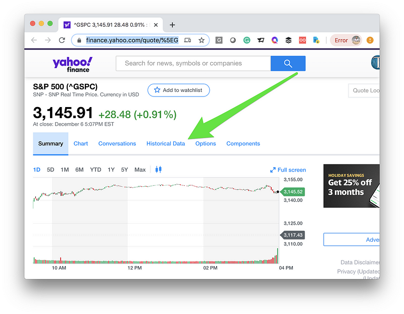
Click on the “Historical Data” link.
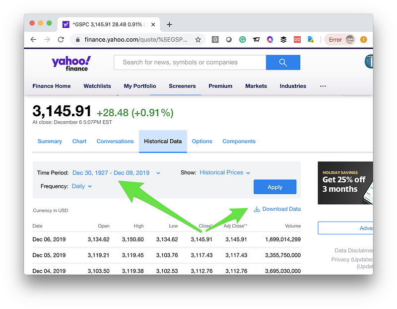
Then select the maximum time period available (yes, it goes all the way back to 1927), hit the blue “Apply” button, and finally, click on the “Download Data” link. This will download all that data into a comma-delimited file (CSV) onto your local machine.
Python and Matplotlib
Open your trusted Jupyter notebook in the same folder where you put the S&P 500 CSV from Yahoo. Call in a few libraries including “Matplotlib”. Load the data in memory using “Pandas” and clean it up a bit.
%matplotlib inline
import matplotlib
import matplotlib.pyplot as plt
import pandas as pd
import numpy as np
import datetime
path_to_market_data = ‘/Users/manuel/Documents/financial-research/market-data/2019–12–06/’
sp500_df = pd.read_csv(path_to_market_data + ‘^GSPC.csv’)
sp500_df[‘Date’] = pd.to_datetime(sp500_df[‘Date’])
sp500_df = sp500_df.sort_values(‘Date’, ascending=True)
sp500_df.head()
fig, ax = plt.subplots(figsize=(16, 8))
plt.plot(sp500_df[‘Date’], sp500_df[‘Adj Close’], color=’blue’)
plt.title(‘S&P 500’)
plt.grid()
plt.show()
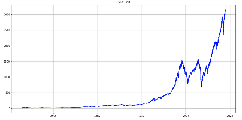
Pretty simple, right? Let’s add the volume to the chart as it is included in the downloaded data. Yes, still trivial to do with Matplotlib by adding an additional y-axis.
sp500_df_tmp = sp500_df[sp500_df['Date'] > '01-01-2006']
fig, ax = plt.subplots(figsize=(16, 8))
plt.plot(sp500_df_tmp['Date'], sp500_df_tmp['Adj Close'], color='blue')
ax.legend(loc='upper left', frameon=False)
plt.title('S&P 500')
plt.grid()
# Get second axis
ax2 = ax.twinx()
plt.plot(sp500_df_tmp['Date'],
         sp500_df_tmp['Volume'], label='Volume', color='red')
ax2.legend(loc='lower right', frameon=False)
plt.show()
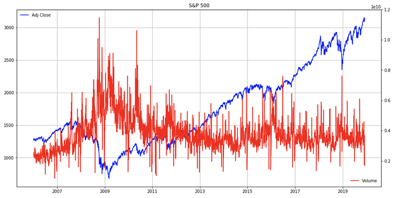
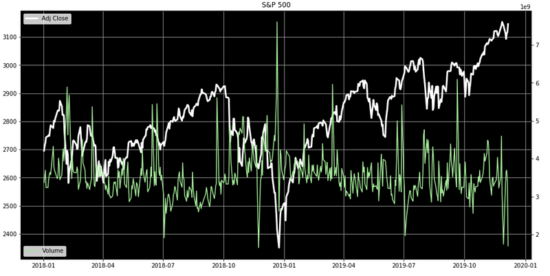
See what I mean by “Granddaddy of All Indicators”? Look at the traded volume overlay in red, it seems to spike in troubled times.
Clearing Things Up With A Rolling Average
Let’s slow the volume a bit by applying a rolling average. This will make it easier on our eyes. A rolling average simple travels a data series chronologically and averages a certain amount of past data to calculate a new point. This is easy to do in Pandas using the “rolling()” function.
sp500_df_tmp = sp500_df[sp500_df['Date'] > '01-01-2006']
fig, ax = plt.subplots(figsize=(16, 8))
# ax.set_facecolor('xkcd:black')
plt.plot(sp500_df_tmp['Date'], sp500_df_tmp['Adj Close'], linewidth=3, color='blue')
plt.title('S&P 500')
plt.legend(loc='upper left')
plt.grid()# Get second axis
ax2 = ax.twinx()
plt.plot(sp500_df_tmp['Date'],
sp500_df_tmp['Volume'].rolling(window=50).mean().values, label='Volume', color='red')
ax2.legend(loc='lower right', frameon=False)
plt.show()
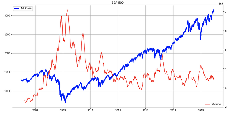
Yup, we can see that rising volumes spell change and/or trouble. This makes sense as worried people will dump positions, others will jump into the speculation fray for that Shiller “irrational exuberance” effect. There’s probably a myriad of reasons and stories associated with these spikes but we don’t really care about the “why”, we really only care about the “when”.
In Closing
Like I said before, there is nothing more satisfying than answering our own market questions!
Is this how hedge fund superstar Renaissance Technologies found its first patterns? Who knows, and it certainly wasn’t in Python (Python is old, but Renaissance is older).
If you like this kind of approach, the all-hands-rollup-your-sleeves approach, check out my free introduction class at the ViralML School, simply signup for my newsletter and I’ll send it to you for free.
(Even if you are already on my newsletter and want to the class, simply signup again and click 'YES' on the…www.viralml.com
Here is the link to “The Applied Fundamental Market Analysis with Python Track” if you want to read more about it.